

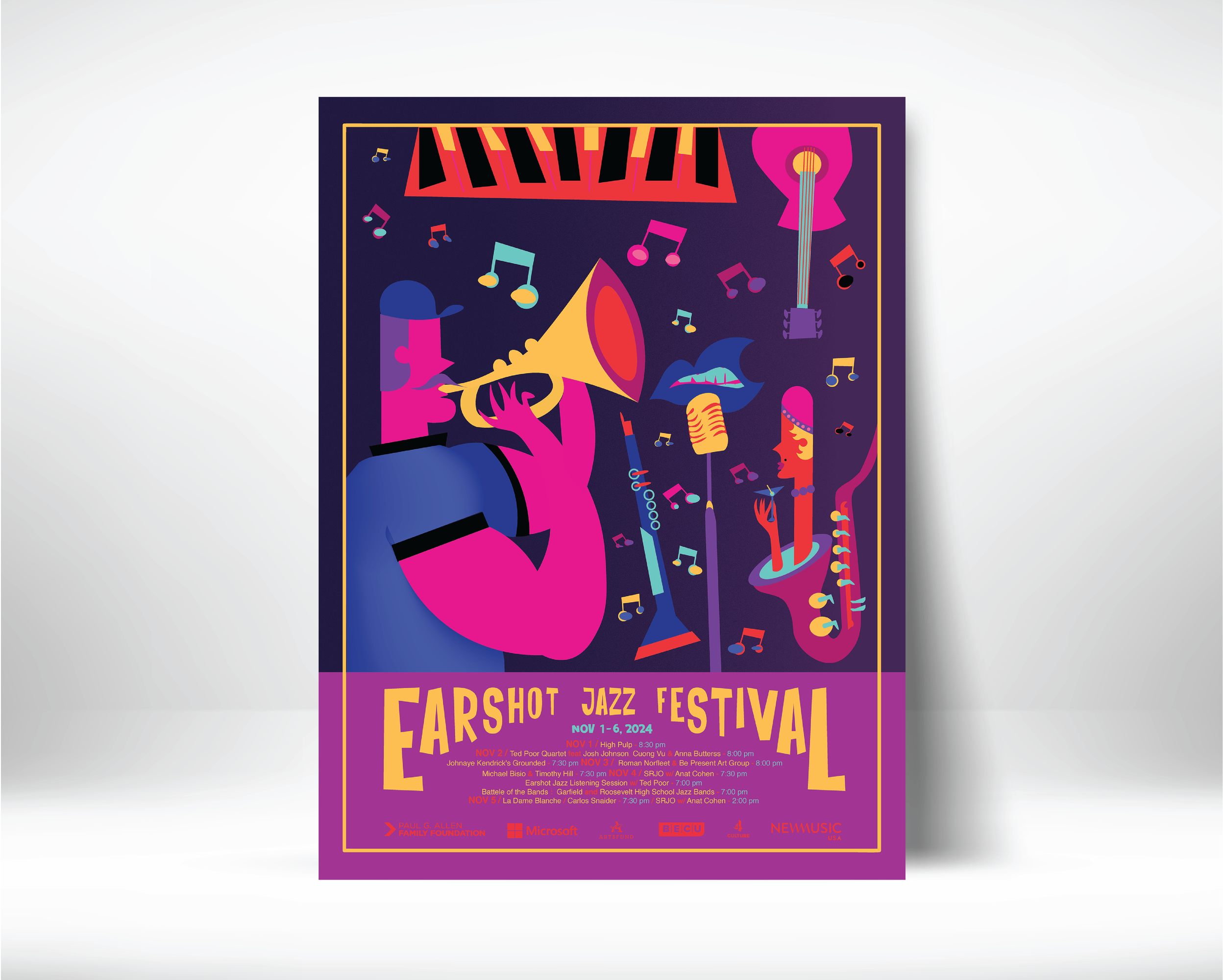
This poster concept for the Earshot Jazz Festival captures the energy and spontaneity of live jazz through expressive illustration, exaggerated forms, and rhythmic composition. A vibrant neon palette evokes Seattle nightlife, while the interplay of musicians, instruments, and abstract shapes creates a sense of movement that reflects the improvisational nature of jazz.
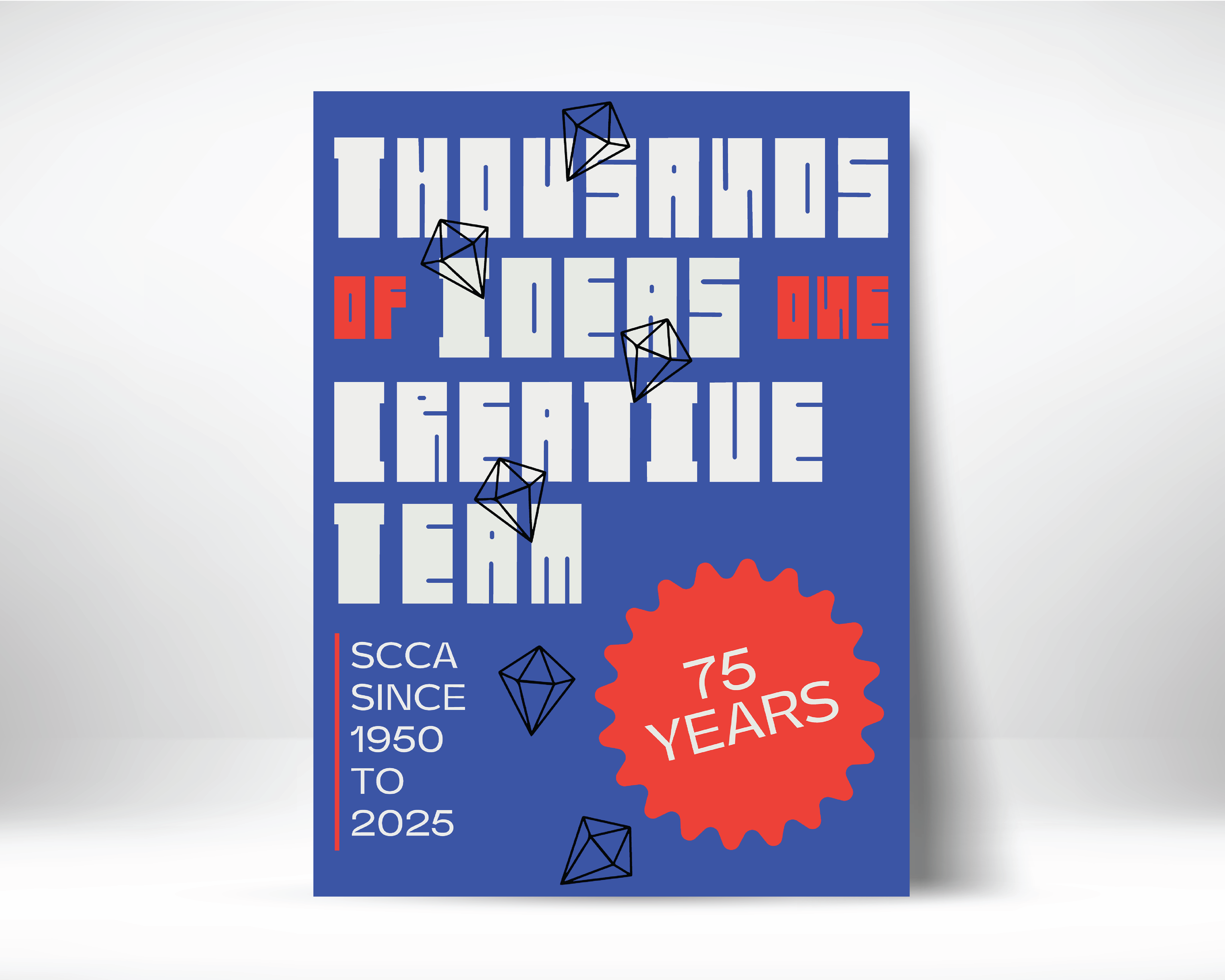
Created for SCCA’s 75th anniversary, this typographic poster celebrates the school’s creative legacy through a bold, contemporary interpretation of mid-century design. A custom typeface, geometric forms, and a vibrant blue and orange palette balance historical reference with a fresh visual language, reflecting 75 years of design education and creative evolution.
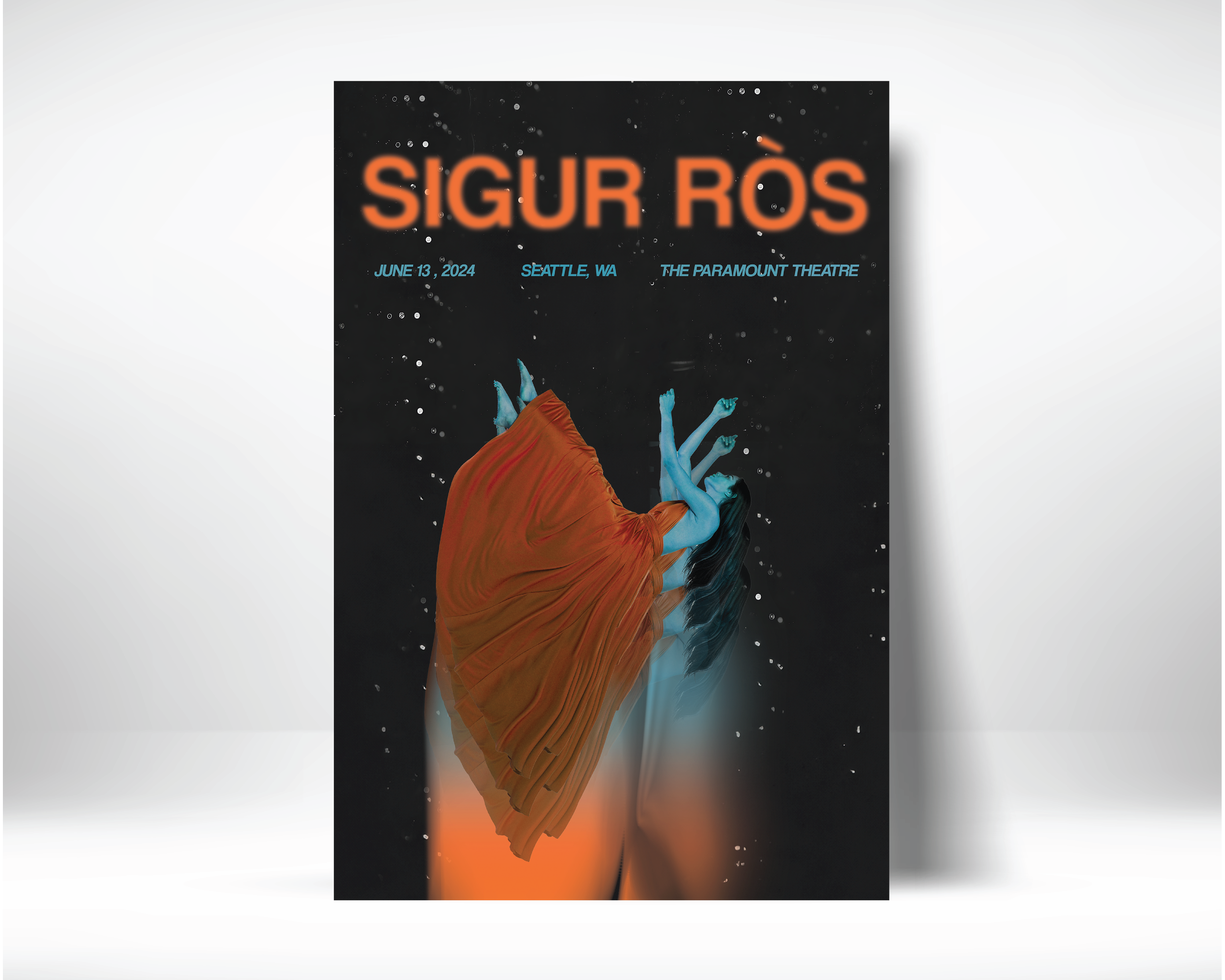
This promotional poster concept for Sigur Rós translates the band’s atmospheric sound into a dreamlike visual experience. Layered photography, motion blur, and textured imagery create a sense of movement and immersion, while contrasting orange and blue tones bring warmth and intensity to the dark composition.
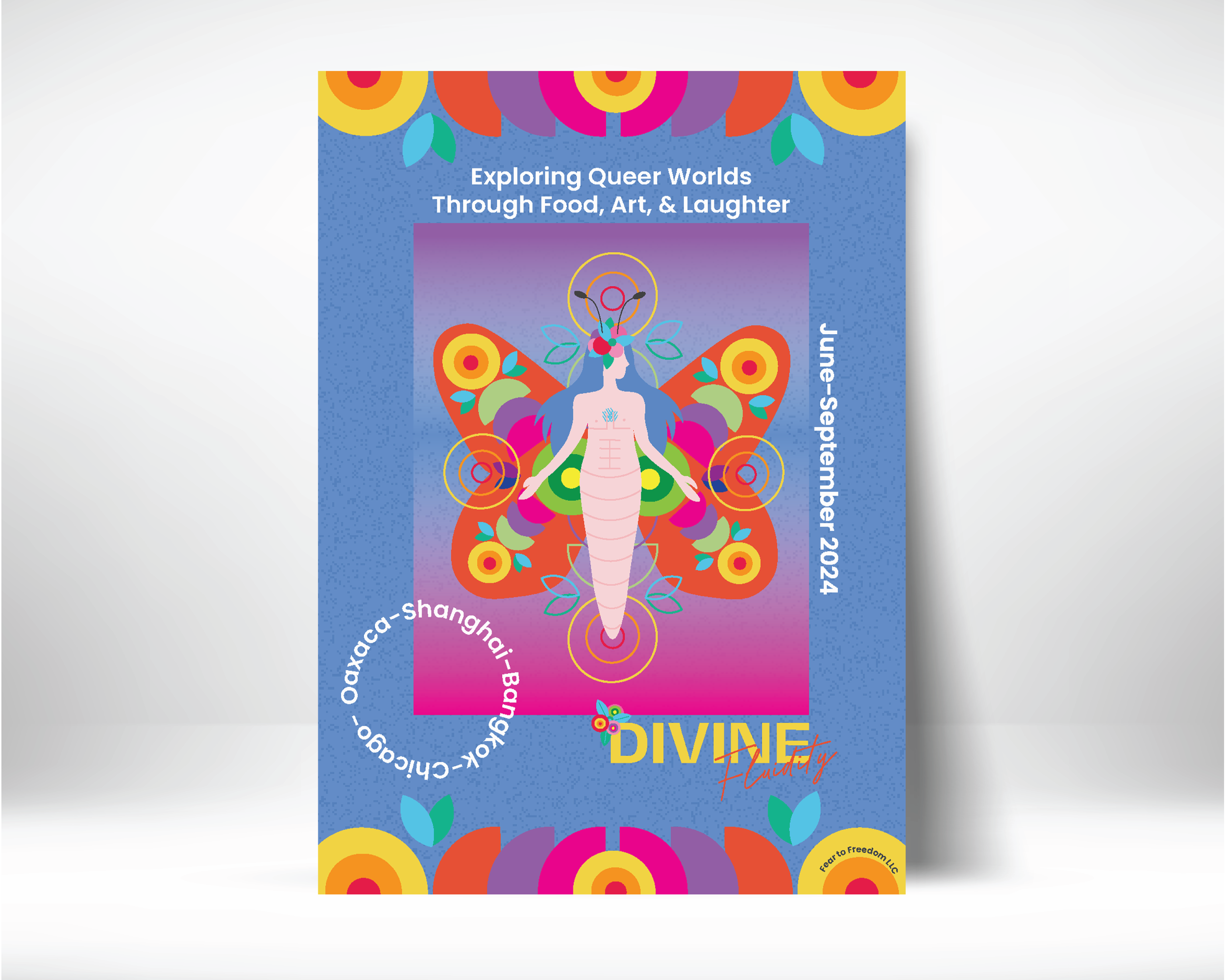
Created for the nonprofit Divine Fluidity, this poster celebrates identity, culture, and self-expression through a vibrant, inclusive visual language. A gender-neutral butterfly figure serves as the central symbol of transformation and freedom, surrounded by bold color, organic forms, and Latin-inspired visual elements that reflect the spirit of the organization and its community.
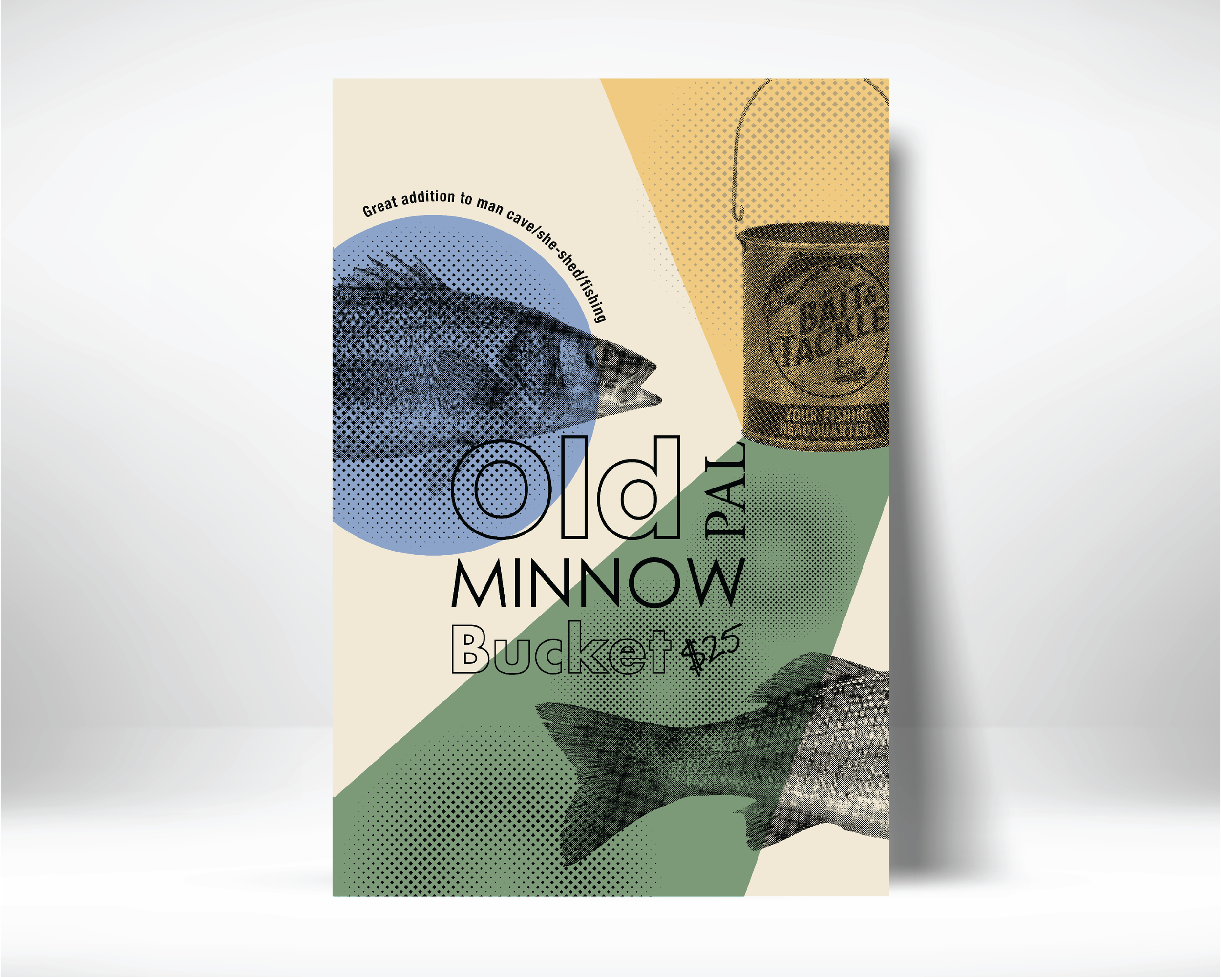
This promotional poster concept reimagines a vintage Pal Minnow bait bucket through a mid-century-inspired visual language. Halftone photography, layered typography, and a muted retro palette reference classic print advertising, creating a nostalgic identity that connects the product with its history and outdoor culture.