OVERVIEW
I designed a poster for the "Earshot Jazz Festival" featuring illustrations of people with elongated limbs and objects with irregular shapes. My goal was to create a dynamic atmosphere that reflects the rhythm of jazz. Additionally, I used neon colors to convey joy and evoke the vibrant ambiance of nightlife.
-
Solo
-
2 weeks
-
Photoshop + Illustrator
OVERVIEW
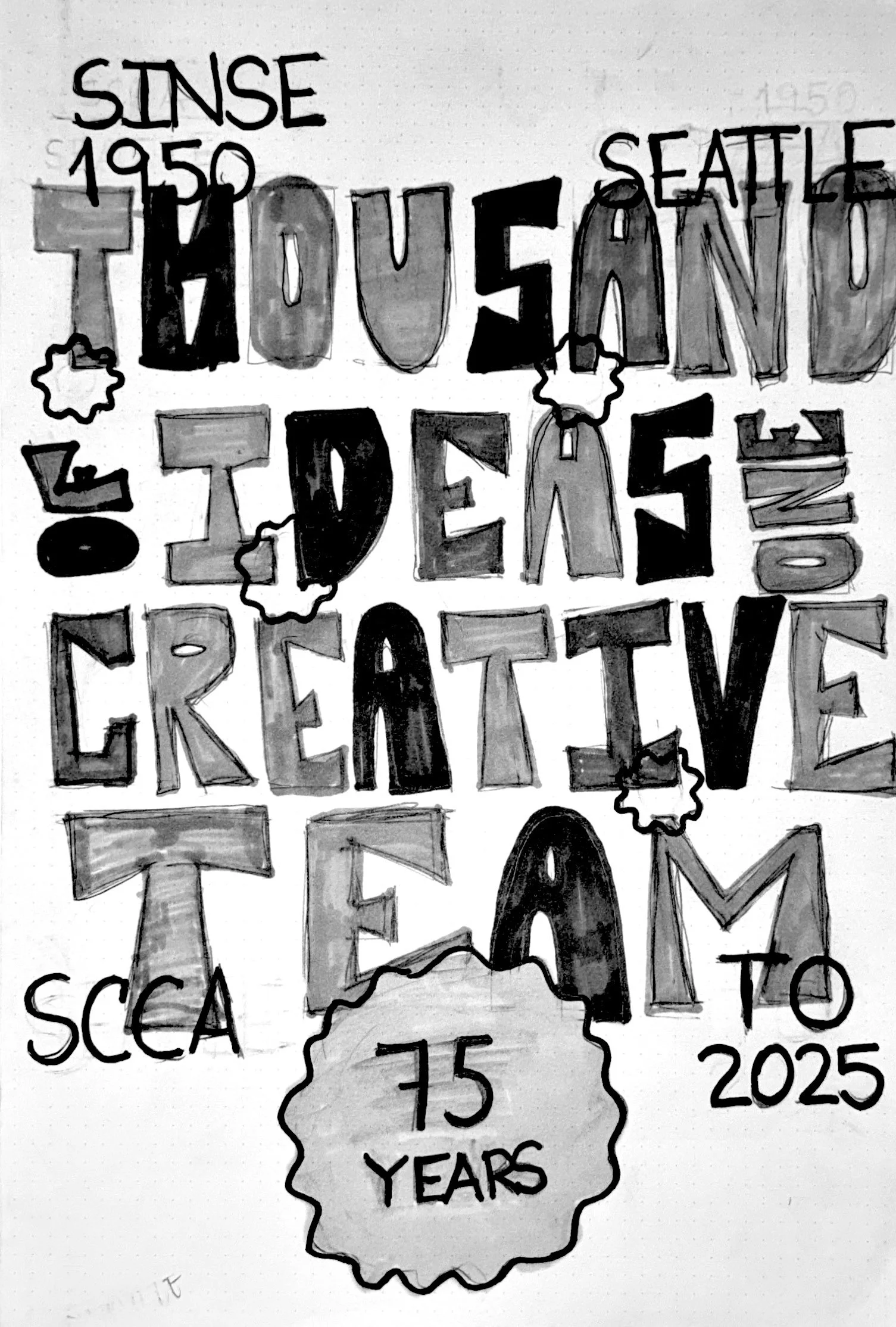
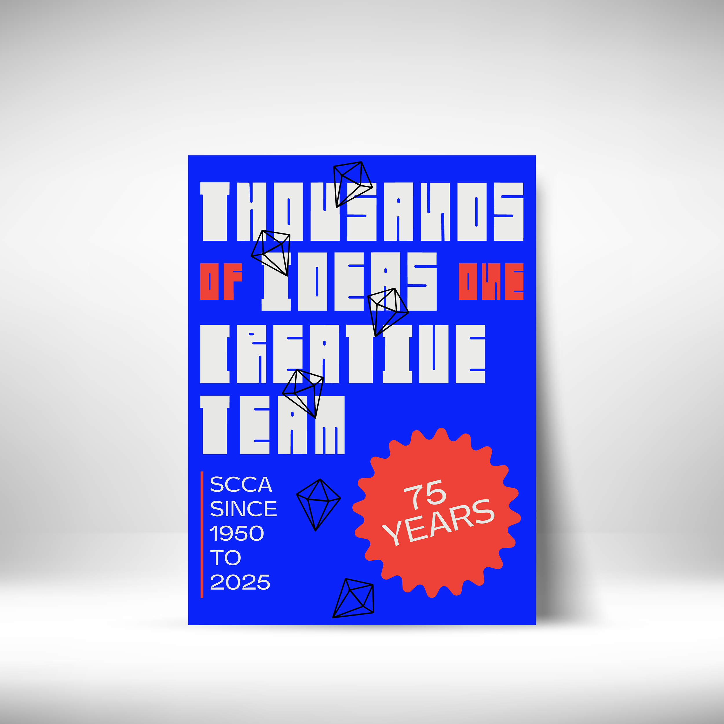
To celebrate SCCA’s 75th anniversary, I created a bold typographic poster featuring a custom display typeface inspired by mid-century design and reinterpreted through my own graphic voice. The vibrant blue and orange palette reflects both celebration and my personal identity. This piece honors the school’s legacy and the creative foundation it gave me.
-
Solo
-
2 weeks
-
Photoshop + Illustrator

OVERVIEW
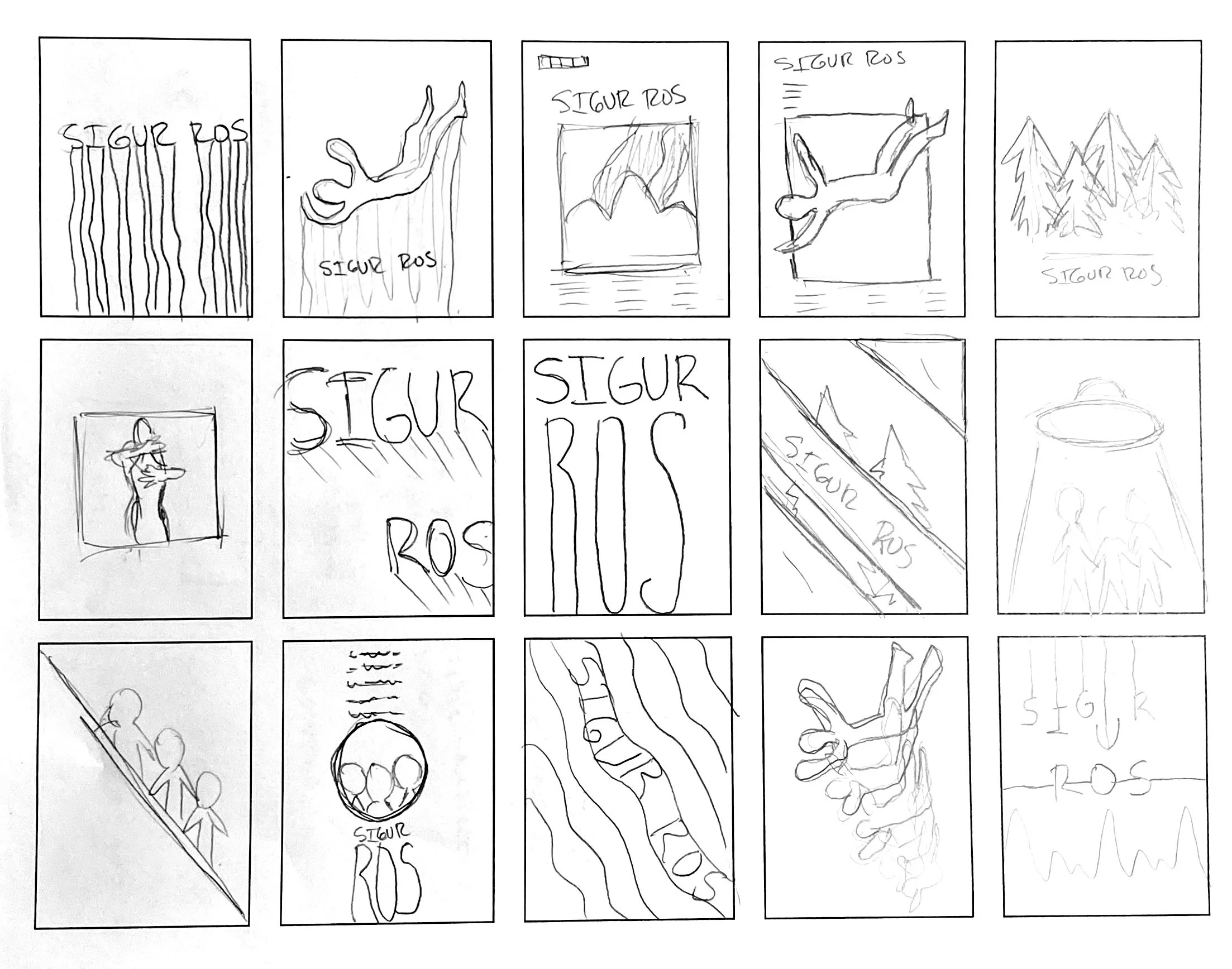
The design was based on a random student who chose their favorite band, colors, and style. I decided to incorporate photography with a faded effect and a sense of nostalgia through effects and colors. The result is a poster that accentuates the musical style of Sigur Rós.
-
Solo
-
3 weeks
-
Procreate + Illustrator

OVERVIEW
To create this design, I was assigned a random Craigslist ad and a fellow student from my class whose style I had to base my design on. The student I was paired with is a huge fan of mid-century design, photography, and vintage style. The ad I received was for selling an old Pal Minnow bucket.
-
Solo
-
2 weeks
-
Photoshop + Illustrator
SKETCHES